American pecans logo
Interested in recipes, nutrition, or research? Visit eatpecans.com
CMS Manual > Page Builder

Page Builder

The Page Builder is a feature in Xperience that enables you to create and manage content directly on the page's UI within the CMS. This section explains how to add, change, modify and delete content for pages that use the Page Builder feature.

Page Builder Overview

Page Builder is a feature of Xperience that allows you to create and manage content directly on the UI of the page in the CMS.

Pages that have Page Builder enabled will have the Page Builder option available on the right sidebar. On your website, the following Content Types have the Page Builder tool enabled:

  • Home page
  • General Content
  • Article Detail
  • Event Detail
  • Dynamic Data Reports

Key Features of Page Builder:

  • Easy to use
  • Gives you more control of the content and layout than with structured content while maintaining design consistency
  • Empowers you to create new pages with different content and layouts quickly without having to rely on developer intervention 
  • Provides a better WYSIWYG (what you see is what you get) experience than structured content fields
  • You can build pages or adjust the content and layout using configurable sections and widgets.
    • Add “sections” to a page to determine the group of widgets to use.
    • Add as many widgets as you want to a new page. (Rise has already created a pre-built library of widgets for you to use)
    • Drag and drop widgets to re-order how they’re displayed on the page
    • Copy and paste entire widgets to reuse content and save time

It is recommended to use Page Builder on high-traffic pages, landing pages, or WYSIWYG-heavy pages that require you to tailor both content and design.

To learn more about Page Builder from Xperience, visit the official Kentico documentation

Return to TOP

Page Builder Sections

When using Page Builder, you can localize the widgets by adding "sections," which are components that define the widget zones within editable areas. You should always add a "section" first before adding a widget.

Rise created a library of sections for you to use:
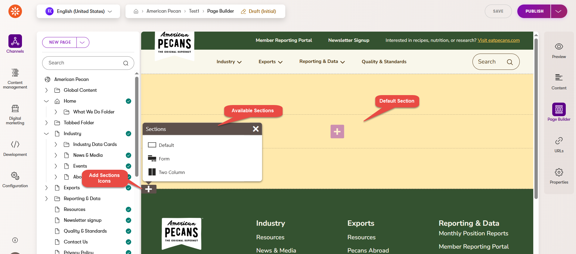
  • Default Section 
  • Form Section
  • Two Column Section

Return to TOP

Sections Overview

  • When creating a page using Page Builder, you first see a default editable section.
  • You can add multiple sections on a page. (Instructions below) 
  • After adding a section, you can then add the widget(s) to the section. To learn more about this, visit the Page Builder Widgets section.

AP Sections Overview

Return to TOP

How to Add a Section

  1. Navigate to the American Pecan website channel
  2. Find and select any page from the tree where the Page Builder tool is enabled (e.g., General Content Page)
  3. Click on Page Builder option from the right sidebar, or make sure it is selected
  4. Click on Edit Page button
  5. Click on the translucent gray + icon on the left side of the page
  6. In the Section Library window that pops up, click on the section of your preference to add it to the page (e.g., Default Section)
  7. Click on Save button
  8. Once you are ready for the changes to be visible on the website, click on Publish

Return to TOP

How to Move a Section

  1. Navigate to the American Pecan website channel 
  2. Find and select any page from the tree where the Page Builder tool is enabled (e.g, General Content Page)
  3. Click on Page Builder option from the right sidebar, or make sure it is selected
  4. Scroll and find the section to be moved
  5. Hover over the section, once the hand icon is displayed, drag and drop the section in the place of your preference
  6. Click on Save button
  7. Once you are ready for the changes to be visible on the website, click on Publish

Return to TOP

How to Change a Section Type

  1. Navigate to the American Pecan website channel
  2. Find and select any page from the tree where the Page Builder tool is enabled (e.g, General Content Page)
  3. Click on Page Builder option from the right sidebar, or make sure it is selected
  4. Scroll and find the section to be changed
  5. Hover over the section, and click on Change Section Type (the square icon) that displays in the gray toolbar on the right side of the section
  6. In the Change Section Type window that pops up, click on the section of your preference (e.g., Two Column), and the section will change
  7. Click on Save button
  8. Once you are ready for the changes to be visible on the website, click on Publish

Return to TOP

How to Change the Section Background Color

  1. Navigate to the American Pecan website channel 
  2. Find and select any page from the tree where the Page Builder tool is enabled (e.g, General Content Page)
  3. Click on Page Builder option from the right sidebar, or make sure it is selected
  4. Scroll and find the section to be configured
  5. Hover over the section and click on Configure Section (the gear icon) that displays in the gray toolbar on the right side of the section
  6. Select the background color option you want
  7. Click on Apply button
  8. Click on Save button
  9. Once you are ready for the changes to be visible on the website, click on Publish

Return to TOP

How to Delete a Section

  1. Navigate to the American Pecan website channel
  2. Find and select any page from the tree where the Page Builder tool is enabled (e.g, General Content Page)
  3. Click on Page Builder option from the right sidebar, or make sure it is selected
  4. Scroll and find the section to be deleted
  5. Hover over the section and click on the trash bin icon that displays in the gray toolbar on the right side of the section
  6. Click on OK button to confirm deletion
  7. Click on Save button
  8. Once you are ready for the changes to be visible on the website, click on Publish

Return to TOP

Page Builder Widgets

After you add a section to your page, you need to add the widget(s) you want to use to the section. A widget is a component that has specific functionalities.

Return to TOP

Widgets Overview

After you added a section or sections to your page, you need to add widgets to those sections. For a review on how Page Builder Sections work, click here.

Widgets are different components that have specific functionalities. 
This section of the manual will explain each widget and how.

Rise created a library of Widgets for you to use:


  • 50/50 Content
  • 50/50 Dual CTA
  • 404 Not Found
  • Accordion
  • Bio Card Grid
  • Card Carousel
  • Card Grid
  • Card Image/Icon Display
  • Carousel
  • Center Image w/ Short Paragraph
  • Data Report
  • DYK Widget
  • Event Grid Widget
  • Form
  • Hero
  • Icons With Text List
  • Infographic Carousel
  • News & Media Grid
  • Recipe Grid
  • Recipe Showcase
  • Research Library Grid
  • Resource Grid
  • Rich Text Widget
  • Signup Widget
  • Social Content
  • Stats 
  • Tabbed Card Widget
  • Video

How to Add a Widget to a Section

  1. Navigate to the American Pecan website channel
  2. Find and select any page from the tree where the Page Builder tool is enabled (e.g, General Content Page)
  3. Click on Page Builder option from the right sidebar, or make sure it is selected
  4. Click on the translucent gray + icon on the left side of the page
  5. Select the section of your preference to add it to the page (e.g., Default Section)
  6. Click on the + icon at the center of the section
  7. Find and select the widget of your preference (e.g., Card Grid)
  8. Click on Save button
  9. Once you are ready for the changes to be visible on the website, click on Publish

Return to TOP

How to Configure the Hero Widget

AP Homepage Widget


  1. Add the widget to the page
  2. Click on Configure Widget (the gear icon) to configure the widget properties
  3. Configure the widget fields. A description of each field is listed below 
  4. Click on Apply button
  5. Click on Save button
  6. To preview your changes before submitting, click on the Preview option from the right sidebar and select Open in New Tab (optional)
  7. Once you are ready for the changes to be visible on the website, click on Publish

The Hero widget has the following properties:

  • Hero Type: Use this section to select the hero layout to be displayed on the page

Note 1: Different fields are shown depending on the hero type selected.

Note 2: It is recommended to use the Homepage Style only on top-level pages (e.g., All About Pecans)

Note 3: The background of the Homepage Style cannot be modified.

  • *Background: Do not use this section to set the widget background color. To update the background color, use the Configure section instead.
    Note: You must select the None option in the Background section of the widget properties so that the color set in the Configure section is applied correctly.

  • Headline: Use this field to set the headline of the widget
  • Subheading: Use this field to set the subheading of the widget
  • CTA Text: Use this field to set the title of the CTA 
  • Select a Page or Enter a URL: Use this field to set the URL of the CTA 
  • Target: Use this field to set if the page/URL will be opened in the same or a new tab 
  • Image: Use this field to set a custom image
  • YouTube URL: Use this field to set the YouTube URL (please use the "regular" YouTube URL with ?rel=0 attached to avoid displaying recommended videos)
  • Video Title: Use this field to set the title for the Video
  • Video CTA Text: Use this field to set the title for the CTA
  • Select Item: Use this field to set a recipe page or an image
  • Publish Date: Use this field to set the date for the article
  • Display Breadcrumbs checkbox: Check this field to display the breadcrumbs on the page
  • Padding Top Override: Use this field to override the default top padding and select a custom value for the widget
  • Padding Bottom Override: Use this field to override the default bottom padding and select a custom value for the widget


Return to TOP

How to Configure the Card Image/Icon Display Widget

Card Image Icon Display Widget - American Pecan Style


  1. Add the widget to the page
  2. Click on Configure Widget (the gear icon) to configure the widget properties
  3. Configure the widget fields. A description of each field is listed below 
  4. Click on Apply button
  5. Click on Save button
  6. To preview your changes before submitting, click on the Preview option from the right sidebar and select Open in New Tab (optional)
  7. Once you are ready for the changes to be visible on the website, click on Publish


The Card Image/Icon Display widget has the following properties:
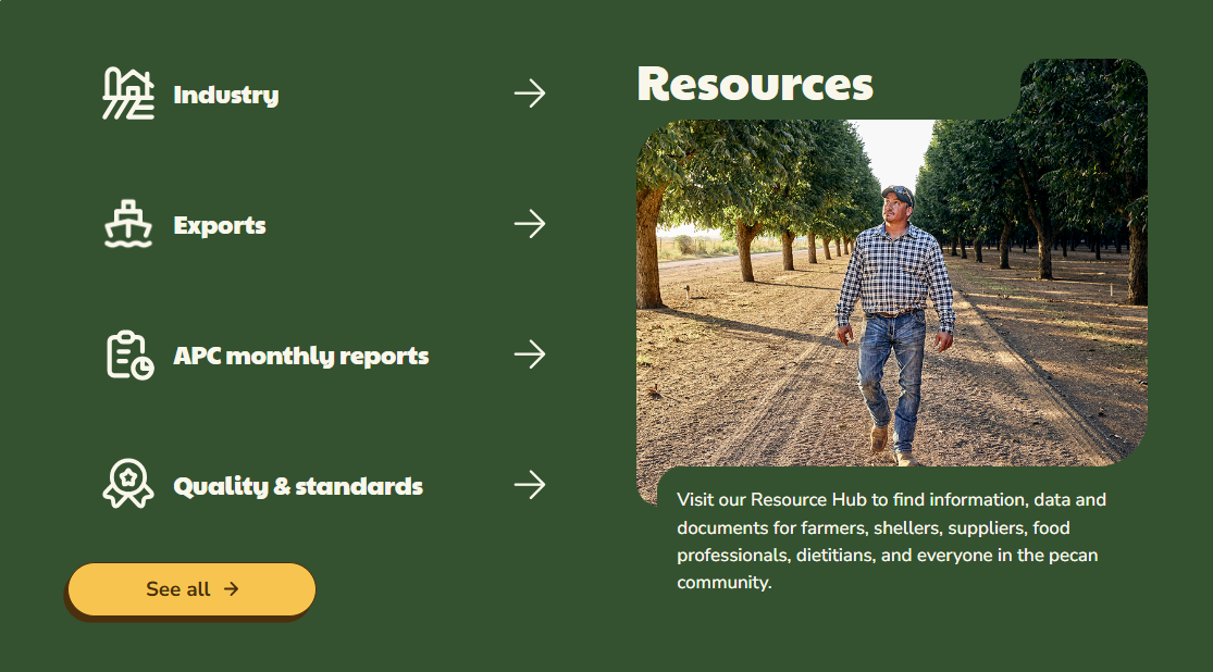
  • Variant Type: Use this section to select the variant type layout to be displayed on the page
    Note 1: Different fields are shown depending on the hero type selected.
    Note 2: The Toggle Info Style is used on the American Pecan homepage

  • Headline: Use this field to set the headline of the widget
  • Subheadline: Use this field to set the subheading of the widget
  • Card Selection:  Use this section to select the card's source (Folder, Individual Bios)
  • Select a Folder of Cards: Use this section to select the folder where the cards were created (appears only if the Folder option is selected)
  • Select Cards: Use this section to select individual cards (appears only if the Individual Bios option is selected)
  • Cards have icons: Select this checkbox if you desire the cards to have icons
  • Make Card Titles Blue: Select this checkbox if you desire the card titles to be blue
  • CTA Text: Use this field to set the title for the CTA
  • Select a Page or Enter a URL: Use this field to set the URL of the CTA
  • Target: Use this field to set if the page/URL will be opened in the same or a new tab 
  • Padding Top Override: Use this field to override the default top padding and select a custom value for the widget
  • Padding Bottom Override: Use this field to override the default bottom padding and select a custom value for the widget


How to Create Card Items

  1. Create a new folder
  2. Be sure the new folder is selected and click on the three dots (next to the folder name)
  3. Click on New Page option
  4. Enter a name for the item
  5. Select the Card Item content type
  6. Click on Continue button
  7. Fill out the fields
  8. Click on Save button
  9. Click on Publish button

Return to TOP

How to Configure the Tabbed Card Widget


AP Tabbed Card Widget

  1. Add the widget to the page
  2. Click on Configure Widget (the gear icon) to configure the widget properties
  3. Configure the widget fields. A description of each field is listed below 
  4. Click on Apply button
  5. Click on Save button
  6. To preview your changes before submitting, click on the Preview option from the right sidebar and select Open in New Tab (optional)
  7. Once you are ready for the changes to be visible on the website, click on Publish


The Tabbed Card widget has the following properties:

Defaults Section

  • Content Headline: Use this field to set the headline of the widget
  • Content Description: Use this field to set the description of the widget
  • Selected Image: Use this field to set a custom image

Main Section

  • Select a Folder of Tabbed Cards: Use this option to select the existing folder where the tabbed cards were created
  • Show CTA Checkbox: Select the checkbox if you desire to display a CTA button 
  • CTA Text: Use this field to set the title of the CTA
  • Select a Page or Enter a URL:  Use this field to set the URL of the CTA
  • Target: Use this field to set if the page/URL will be opened in the same or a new tab
  • Padding Top Override: Use this field to override the default top padding and select a custom value for the widget
  • Padding Bottom Override: Use this field to override the default bottom padding and select a custom value for the widget 


How to Create Tab Items

  1. Create a new folder
  2. Be sure the new folder is selected and click on the three dots (next to the folder name)
  3. Click on New Page option
  4. Enter a name for the item
  5. Select the Tab Item content type
  6. Click on Continue button
  7. Fill out the fields
  8. Click on Save button
  9. Click on Publish button

Return to TOP

How to Configure the 50/50 Content Widget

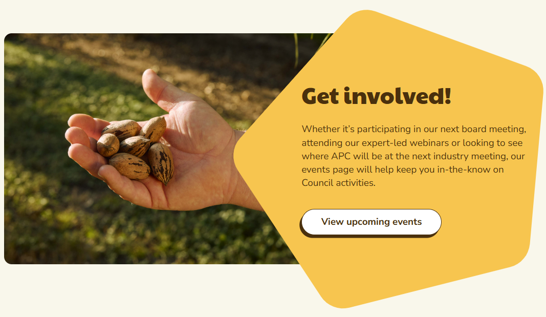
AP 50/50 Widget

  1. Add the widget to the page
  2. Click on Configure Widget (the gear icon) to configure the widget properties
  3. Configure the widget fields. A description of each field is listed below 
  4. Click on Apply button
  5. Click on Save button
  6. To preview your changes before submitting, click on the Preview option from the right sidebar and select Open in New Tab (optional)
  7. Once you are ready for the changes to be visible on the website, click on Publish

The 50/50 Content widget has the following properties:

  • Headline: Use this field to set the headline of the widget
  • Content: Use this field to set the content of the widget
  • Citation: Use this field to set the citation of the widget
  • Display CTA Button: Select the checkbox if you desire to show a CTA button
  • CTA Text: Use this field to set the title for the CTA (appears only if the CTA Button checkbox is selected)
  • CTA URL: Use this field to set the URL for the CTA (appears only if the CTA Button checkbox is selected)
  • Open in a new window: Select the checkbox if you desire to display the CTA URL in a new window
  • Image: Use this field to set a custom image
  • Media Position: Use this section to set the media position of the widget
  • Use Content Shape: Select the checkbox if you desire to add a rounded pentagon shape to the content background
  • Padding Top Override: Use this field to override the default top padding and select a custom value for the widget
  • Padding Bottom Override: Use this field to override the default bottom padding and select a custom value for the widget
     

Return to TOP

How to Configure the 50/50 Dual CTA Widget


AP 50 50 Dual CTA


  1. Add the widget to the page
  2. Click on Configure Widget (the gear icon) to configure the widget properties
  3. Configure the widget fields. A description of each field is listed below 
  4. Click on Apply button
  5. Click on Save button
  6. To preview your changes before submitting, click on the Preview option from the right sidebar and select Open in New Tab (optional)
  7. Once you are ready for the changes to be visible on the website, click on Publish


The 50/50 Dual CTA widget has the following properties:

  • Left Image: Use this field to set the image of the left side card
  • Left Headline: Use this field to set the title of the left side card
  • Left Content: Use this field to set the content of the left side card
  • Left Background: Use this dropdown to select the color palette for the left side card background
  • Display CTA: Select the checkbox if you desire to display a CTA button on the left card
  • Left CTA Text: Use this field to set the title of the left CTA (appears only if the CTA Button checkbox is selected)
  • Left Select a Page or Enter a URL: Use this field to set the URL of the left CTA (appears only if the CTA Button checkbox is selected)
  • Left CTA Target: Use this dropdown to select the left CTA target
  • CTA Button Style: Use this dropdown to select the left CTA button style 
  • Right Image: Use this field to set the image of the right side card
  • Right Headline: Use this field to set the title of the right side card
  • Right Content: Use this field to set the content of the right side card
  • Right Background: Use this dropdown to select the color palette for the right side card background
  • Display CTA: Select the checkbox if you desire to display a CTA button on the right card
  • Right CTA Text: Use this field to set the title of the right CTA (appears only if the CTA Button checkbox is selected)
  • Right Select a Page or Enter a URL: Use this field to set the URL of the right CTA (appears only if the CTA Button checkbox is selected)
  • Right CTA Target: Use this dropdown to set if the page/URL will be opened in the same or a new tab
  • CTA Button Style: Use this dropdown to select the right CTA button style
  • Padding Top Override: Use this field to override the default top padding and select a custom value for the widget
  • Padding Bottom Override: Use this field to override the default bottom padding and select a custom value for the widget 

Return to TOP

How to Configure the Center Image w/Short Paragraph Widget

AP Center Image Paragraph Widget


  1. Add the widget to the page
  2. Click on Configure Widget (the gear icon) to configure the widget properties
  3. Configure the widget fields. A description of each field is listed below 
  4. Click on Apply button
  5. Click on Save button
  6. To preview your changes before submitting, click on the Preview option from the right sidebar and select Open in New Tab (optional)
  7. Once you are ready for the changes to be visible on the website, click on Publish


The Center Image w/Short Paragraph widget has the following properties:

  • Background Type: Use this section to select the color for the widget background
  • Image: Use this field to set a custom image
  • Display image as: Use this section to define the image display style
  • Headline: Use this field to set the headline of the widget
  • Content:  Use this field to set the content of the widget
  • CTA Text:  Use this field to set the title for the CTA
  • Select a Page or Enter a URL:  Use this field to set the URL of the CTA
  • Target: Use this field to set if the page/URL will be opened in the same or a new tab
  • Padding Top Override: Use this field to override the default top padding and select a custom value for the widget
  • Padding Bottom Override: Use this field to override the default bottom padding and select a custom value for the widget 

Return to TOP

How to Configure the Card Grid Widget

AP Card Grid Widget


  1. Add the widget to the page
  2. Click on Configure Widget (the gear icon) to configure the widget properties
  3. Configure the widget fields. A description of each field is listed below 
  4. Click on Apply button
  5. Click on Save button
  6. To preview your changes before submitting, click on the Preview option from the right sidebar and select Open in New Tab (optional)
  7. Once you are ready for the changes to be visible on the website, click on Publish

The Card Grid widget has the following properties:
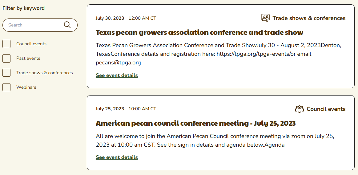
  • Layout: Use this section to select the layout of the widget
  • Headline: Use this field to set the headline of the widget
  • Card Selection: Use this section to select the card's source (Folder, Individual Cards)
  • Select a Folder of Cards: Use this section to select the folder where the cards were created (appears only if the Folder option is selected)
  • Select Cards: Use this section to select individual cards (appears only if the Individual Cards option is selected)
  • Padding Top Override: Use this field to override the default top padding and select a custom value for the widget
  • Padding Bottom Override: Use this field to override the default bottom padding and select a custom value for the widget


How to Create Card Items

  1. Create a new folder
  2. Be sure the new folder is selected and click on the three dots (next to the folder name)
  3.  Click on New Page option
  4. Enter a name for the item
  5. Select the Card Item content type
  6. Click on Continue button
  7. Fill out the fields
  8. Click on Save button
  9. Click on Publish button

Return to TOP

How to Configure the Event Grid Widget

AP Events Grid Widget

  1. Add the widget to the page
  2. Click on Configure Widget (the gear icon) to configure the widget properties
  3. Configure the widget fields. A description of each field is listed below 
  4. Click on Apply button
  5. Click on Save button
  6. To preview your changes before submitting, click on the Preview option from the right sidebar and select Open in New Tab (optional)
  7. Once you are ready for the changes to be visible on the website, click on Publish

The Event Grid widget has the following properties:

  • Type: Use this section to select the event grid type to be displayed on the page

Note: Different fields are shown depending on the event grid type selected
  • Container: Use this section to select the events container
  • Show Filters: Select the checkbox if you desire to display the filters on the page
  • Event Selection: Use this section to select the event source (Folder, Individual Events, or Most Recent)
  • Container: Use this section to select the folder where the events are stored (appears only if the Folder option is selected)
  • Select one or many Taxonomies to be pre-selected on load: Use this section to select one or many Taxonomies to be pre-selected on load (appears only if the Advanced Grid option is selected)
  • Events Per Page: Use this field to set how many events display per page
  • Padding Top Override: Use this field to override the default top padding and select a custom value for the widget
  • Padding Bottom Override: Use this field to override the default bottom padding and select a custom value for the widget


Return to TOP

How to Configure the News & Media Grid Widget

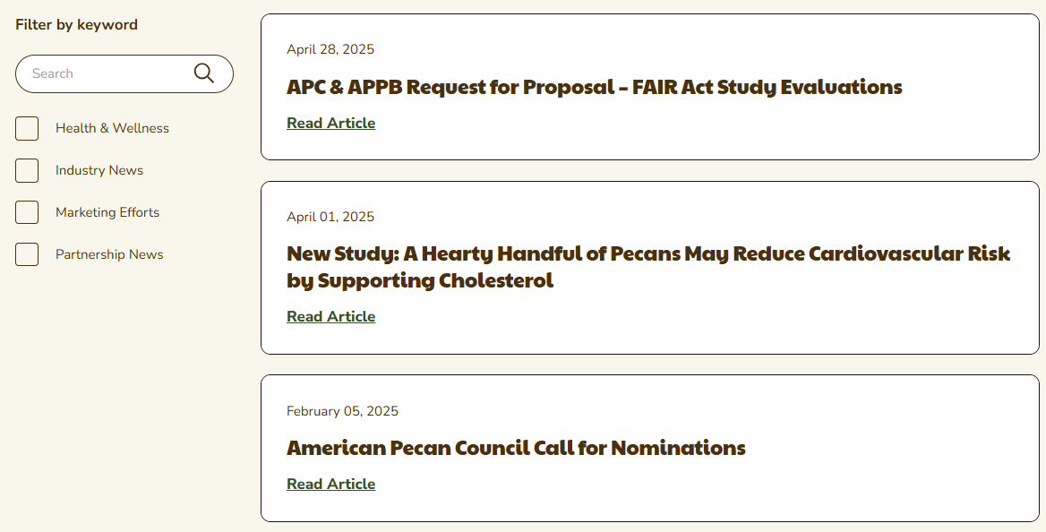
AP News and Media Grid Widget

  1. Add the widget to the page
  2. Click on Configure Widget (the gear icon) to configure the widget properties
  3. Configure the widget fields. A description of each field is listed below 
  4. Click on Apply button
  5. Click on Save button
  6. To preview your changes before submitting, click on the Preview option from the right sidebar and select Open in New Tab (optional)
  7. Once you are ready for the changes to be visible on the website, click on Publish

The News & Media Grid widget has the following properties:

  • Type: Use this section to select the news & media grid type to be displayed on the page

Note: Different fields are shown depending on the news & media grid type selected
  • Article Selection: Use this section to select the news & media article source (Folder, All articles below current page)
  • Show Filters: Select the checkbox if you desire to display the filters on the page
  • Container: Use this section to select the folder where the news & media articles are stored (appears only if the Folder option is selected)
  • Select one or many Taxonomies to be pre-selected on load: Use this section to select one or many Taxonomies to be pre-selected on load (appears only if the Advanced Grid option is selected)
  • Articles Per Page: Use this field to set how many articles display per page
  • Padding Top Override: Use this field to override the default top padding and select a custom value for the widget
  • Padding Bottom Override: Use this field to override the default bottom padding and select a custom value for the widget


Return to TOP

How to Configure the Resource Grid Widget

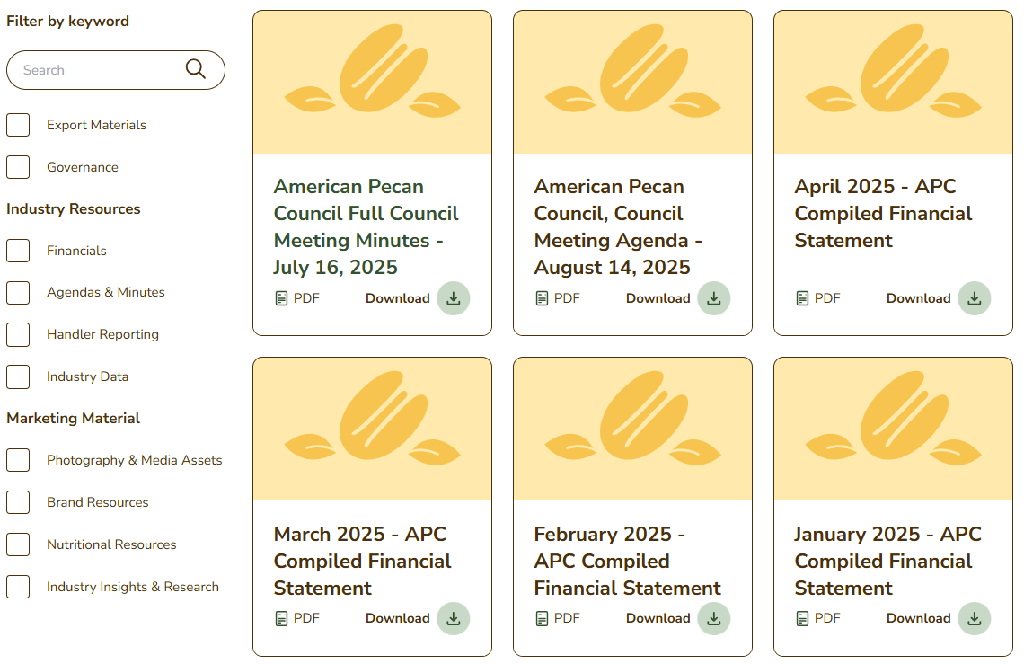
AP Resource Grid

  1. Add the widget to the page
  2. Click on Configure Widget (the gear icon) to configure the widget properties
  3. Configure the widget fields. A description of each field is listed below 
  4. Click on Apply button
  5. Click on Save button
  6. To preview your changes before submitting, click on the Preview option from the right sidebar and select Open in New Tab (optional)
  7. Once you are ready for the changes to be visible on the website, click on Publish


The Resource Grid widget has the following properties:

  • Type: Use this section to select the resource grid type to be displayed on the page

Note: Different fields are shown depending on the resource grid type selected
  • Headline: Use this field to set the headline of the widget
  • Resource Selection: Use this section to select the recipe source (Folder, Individual Resources, or Most Recent)
  • Container: Use this section to select the folder where the resources are stored (appears only if the Folder option is selected)
  • Resources: Use this section to select the individual resources to be displayed (appears only if the Individual Resources option is selected)
  • Show Filters: Select the checkbox if you desire to display the filters on the page
  • Categories: Use this section to select and delimit the categories of the resources to be shown in the Row (appears only if the Most Recent option is selected)
  • Select one parent tag for filters to based off of: Use this section to select the parent tag that the filters will be based on (appears only if the Advanced Grid option is selected)
  • Select one or many Taxonomies to be pre-selected on load: Use this section to select one or many Taxonomies to be pre-selected on load (appears only if the Advanced Grid option is selected)
  • Resources Per Page: Use this field to set how many resources display per page
  • Padding Top Override: Use this field to override the default top padding and select a custom value for the widget
  • Padding Bottom Override: Use this field to override the default bottom padding and select a custom value for the widget


Return to TOP

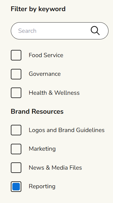
How to Update Resource Category Names

Resources Categories

  1. Make sure you're in the Eat Pecans channel. Click on Channels, then select the Eat Pecans channel
  2. Click on Configuration
  3. Click on Taxonomies
  4. Select the Resource Categories option
  5. Click to expand EP Resource Categories option
  6. Click to expand Brand Resources option
  7. Select the category you want to update
  8. In the Title field, update the category name
  9. Click the Save button

Return to TOP

How to Configure the Bio Card Grid Widget


AP Bio Card Grid


  1. Add the widget to the page
  2. Click on Configure Widget (the gear icon) to configure the widget properties
  3. Configure the widget fields. A description of each field is listed below 
  4. Click on Apply button
  5. Click on Save button
  6. To preview your changes before submitting, click on the Preview option from the right sidebar and select Open in New Tab (optional)
  7. Once you are ready for the changes to be visible on the website, click on Publish


The Card Bio Grid widget has the following properties:

  • Bio Card Grid Type: Use this section to select the bio card grid type to be displayed on the page
  • Headline: Use this field to set the headline of the widget
  • Subheadline: Use this field to set the subheadline of the widget
  • Bio Selection: Use this section to select the bio's source (Folder, Individual Bios)
  • Select a Folder of Bios: Use this section to select the folder where the bio items were created (appears only if the Folder option is selected)
  • Select Bios: Use this section to select individual bios (appears only if the Individual Bios option is selected)
  • Padding Top Override: Use this field to override the default top padding and select a custom value for the widget
  • Padding Bottom Override: Use this field to override the default bottom padding and select a custom value for the widget

How to Create Bio Items

  1. Create a new folder
  2. Be sure the new folder is selected and click on the three dots (next to the folder name)
  3.  Click on New Page option
  4. Enter a name for the item
  5. Select the Bio Item content type
  6. Click on Continue button
  7. Fill out the fields
  8. Click on Save button
  9. Click on Publish button

Return to TOP

How to Configure the Rich Text Widget

AP Rich Text Widget

  1. Add the widget to the page
  2. Click on Configure Widget (the gear icon) to configure the widget properties
  3. Configure the widget fields. A description of each field is listed below 
  4. Click on Apply button
  5. Click on Save button
  6. To preview your changes before submitting, click on the Preview option from the right sidebar and select Open in New Tab (optional)
  7. Once you are ready for the changes to be visible on the website, click on Publish

The Research Library Grid widget has the following properties:
  • Headline: Use this field to set the headline of the widget
  • Content: Use this field to set the content of the widget
  • CTA Text:  Use this field to set the title for the CTA
  • Select a Page or Enter a URL:  Use this field to set the URL of the CTA
  • Target: Use this field to set if the page/URL will be opened in the same or a new tab
  • Padding Top Override: Use this field to override the default top padding and select a custom value for the widget
  • Padding Bottom Override: Use this field to override the default bottom padding and select a custom value for the widget

Return to TOP

How to Configure the Signup Widget

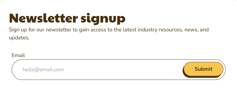
AP Sign Up Widget


  1. Add the widget to the page
  2. Click on Configure Widget (the gear icon) to configure the widget properties
  3. Configure the widget fields. A description of each field is listed below 
  4. Click on Apply button
  5. Click on Save button
  6. To preview your changes before submitting, click on the Preview option from the right sidebar and select Open in New Tab (optional)
  7. Once you are ready for the changes to be visible on the website, click on Publish


The Signup widget has the following properties:

  • Select a Form: Use this dropdown to select the Newsletter Sign Up form to display on the page
  • Edit in Forms: Click this button to open the Form Builder and start a new form
  • After Form Submission: Use this section to select what to display after submitting the form
    • Display a message: displays a field to add a Thank You message
    • Redirect to URL: displays a field to add an  external URL
    • Redirect to a page: displays a field to add an internal page
  • Headline: Use this field to set the headline of the widget
  • Description: Use this field to set the description of the widget


Return to TOP

How to Configure the Icons With Text List Widget


Icons with Text List Widget


  1. Add the widget to the page
  2. Click on Configure Widget (the gear icon) to configure the widget properties
  3. Configure the widget fields. A description of each field is listed below 
  4. Click on Apply button
  5. Click on Save button
  6. To preview your changes before submitting, click on the Preview option from the right sidebar and select Open in New Tab (optional)
  7. Once you are ready for the changes to be visible on the website, click on Publish


The Icons with Text List widget has the following properties:

  • Select Icon w/ Text Items: Use this section to select the items to display in the widget
  • Padding Top Override: Use this field to override the default top padding and select a custom value for the widget
  • Padding Bottom Override: Use this field to override the default bottom padding and select a custom value for the widget


Note: To know how to create a new item, go to the For Icon with Text Items section
Return to TOP

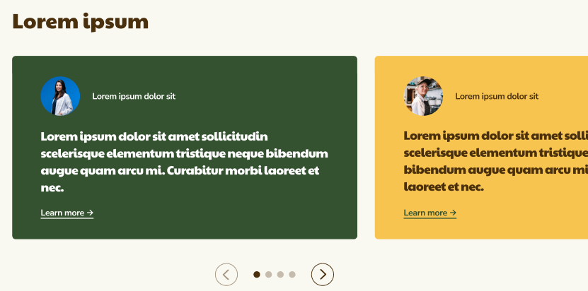
AP Carousel Widget


  1. Add the widget to the page
  2. Click on Configure Widget (the gear icon) to configure the widget properties
  3. Configure the widget fields. A description of each field is listed below 
  4. Click on Apply button
  5. Click on Save button
  6. To preview your changes before submitting, click on the Preview option from the right sidebar and select Open in New Tab (optional)
  7. Once you are ready for the changes to be visible on the website, click on Publish

The Carousel widget has the following properties:

  • Carousel Type: Use this section to select the carousel type to be displayed on the page

Note: Different fields are shown depending on the carousel type selected
  • Headline: Use this field to set the headline of the widget
  • Subheadline: Use this field to set the subheadline of the widget
  • Description: Use this field to set the description of the widget
  • Card Folder: Use this option to select the existing folder where the carousel cards were created 
  • Display Cards in Alternating Colors: Select the checkbox if you desire to display the cards in alternating colors
  • Carousel Images: Use this option to select the existing images to be displayed on the carousel
  • Display CTA Button?: Select the checkbox if you desire to display a CTA button
  • Text: Use this field to set the title of the CTA (appears only if the CTA Button checkbox is selected)
  • URL: Use this field to set the URL of the CTA (appears only if the CTA Button checkbox is selected)
  • Open in a new window?: Select the checkbox if you desire to display the CTA URL in a new window
  • Padding Top Override: Use this field to override the default top padding and select a custom value for the widget
  • Padding Bottom Override: Use this field to override the default bottom padding and select a custom value for the widget

Return to TOP

How to Configure the Form Widget

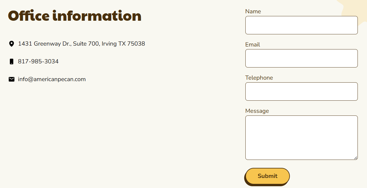
AP Form Widget


  1. Add the widget to the page
  2. Click on Configure Widget (the gear icon) to configure the widget properties
  3. Configure the widget fields. A description of each field is listed below 
  4. Click on Apply button
  5. Click on Save button
  6. To preview your changes before submitting, click on the Preview option from the right sidebar and select Open in New Tab (optional)
  7. Once you are ready for the changes to be visible on the website, click on Publish


The Form widget has the following properties:
  • Select a Form: Use this dropdown to select the form to display on the page
  • After form submission: Use this section to select what to display after submitting the form
    • Display a message: displays a field to add a Thank You message
    • Redirect to URL: displays a field to add an  external URL
    • Redirect to a page: displays a field to add an internal page

Return to TOP

How to Configure the Video Widget


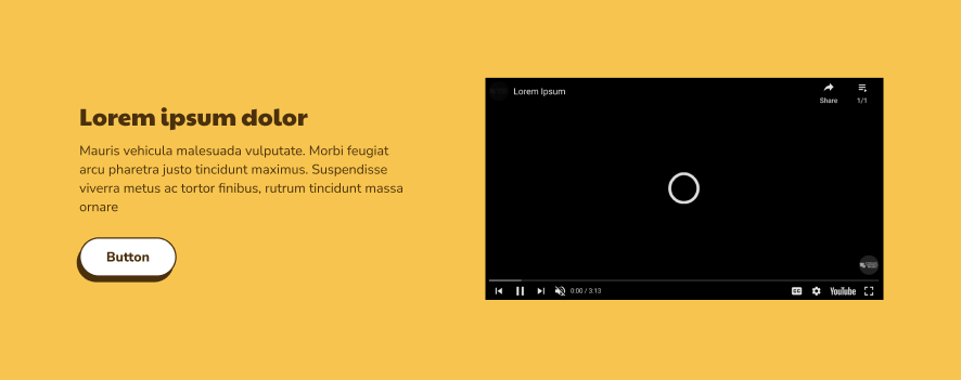
AP Video Widget


  1. Add the widget to the page
  2. Click on Configure Widget (the gear icon) to configure the widget properties
  3. Configure the widget fields. A description of each field is listed below 
  4. Click on Apply button
  5. Click on Save button
  6. To preview your changes before submitting, click on the Preview option from the right sidebar and select Open in New Tab (optional)
  7. Once you are ready for the changes to be visible on the website, click on Publish


The Video widget has the following properties:

  • Layout: Use this section to select the layout of the widget
  • YouTube URL: Use this field to set the YouTube URL (please use the "regular" YouTube URL with ?rel=0 attached to avoid displaying recommended videos)
  • Headline: Use this field to set the headline of the widget
  • Content: Use this field to set the content of the widget
  • CTA Text: Use this field to set the title for the CTA
  • Select a Page or Enter a URL: Use this field to set the URL of the CTA
  • Target: Use this field to set if the page/URL will be opened in the same or a new tab
  • Padding Top Override: Use this field to override the default top padding and select a custom value for the widget
  • Padding Bottom Override: Use this field to override the default bottom padding and select a custom value for the widget

Return to TOP